More
Turn on suggestions
Auto-suggest helps you quickly narrow down your search results by suggesting possible matches as you type.
- Atlas
- /
- Atlas Hub
- /
- Khoros Kudos Awards
- /
- Past Lithys
- /
- Lithys 2017: Barclaycard - Digital CX All-Star
Options
- Subscribe to RSS Feed
- Mark as New
- Mark as Read
- Bookmark
- Subscribe
- Printer Friendly Page
- Report Inappropriate Content
Lithys 2017: Barclaycard - Digital CX All-Star
Our community is quite unique because it not only provides an outlet for community members to document and share their travel histories and experiences, it rewards and fuels their passions by awarding members Participation Miles for their contributions that can be used for future excursions.
----------------------------
Entry submitted by: Jennifer Hitchens, VP, Digital Community
Community: Barclaycard Travel Community
Lithy category: Digital CX All-Star
BarclaycardUS is the 9th largest credit card issuer in the US. We believe that building community environments supports our credit card products and creates a differentiated customer experience through enhanced support and engagement.
The Barclaycard Travel Community: A portion of Barclaycard cardmembers are invited to join a community, share their travel experience, look to other members for travel inspiration and earn miles for engaging in community activities. BarclaycardTravel.com is a one-of-a-kind travel community where Barclaycard cardmembers and non-cardmembers can share travel experiences and earn miles that can be redeemed for travel rewards or e-certificates. Lithium’s new responsive design platform has vastly improved the user experience for Barclaycard Travel Community members and now enables them to participate, share and engage on their mobile device as they are enjoying, or searching, for travel adventures.
Our digital goals
The Barclaycard Travel Community vision is to “create a platform for passionate travelers to share, inspire and reward themselves and others.” Since the community’s launch in 2013, we have focused on the passion people have for traveling and sharing their travel experiences by encouraging our members to share helpful travel stories, tips and pointers. We also focused our efforts on publishing inspiring blog posts to encourage exploration in new and different areas in the world. Our community is quite unique because it not only provides an outlet for community members to document and share their travel histories and experiences, it rewards and fuels their passions by awarding members Participation Miles for their contributions that can be used for future excursions.
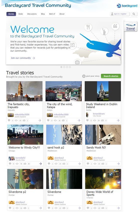
Previous Design:
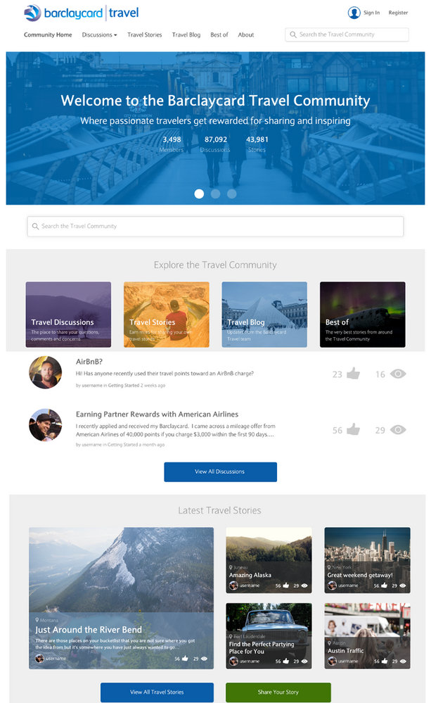
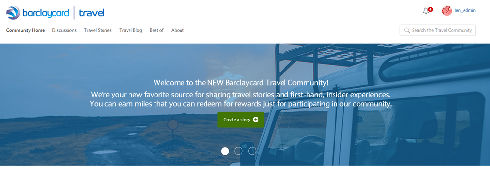
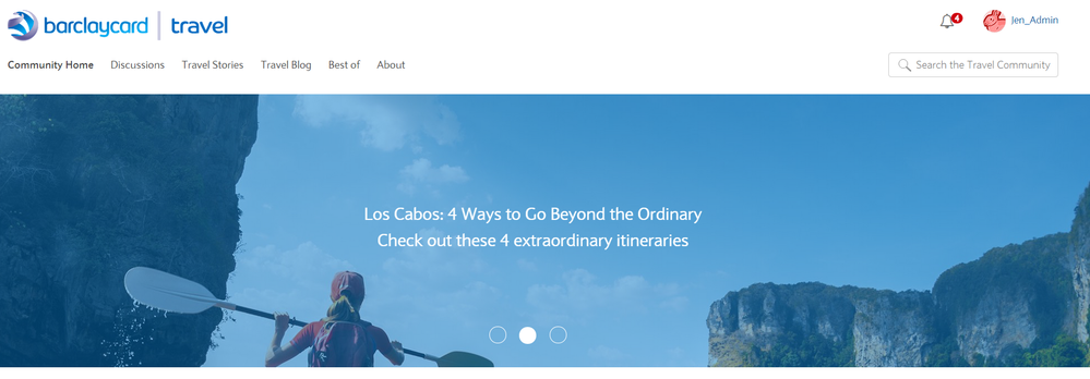
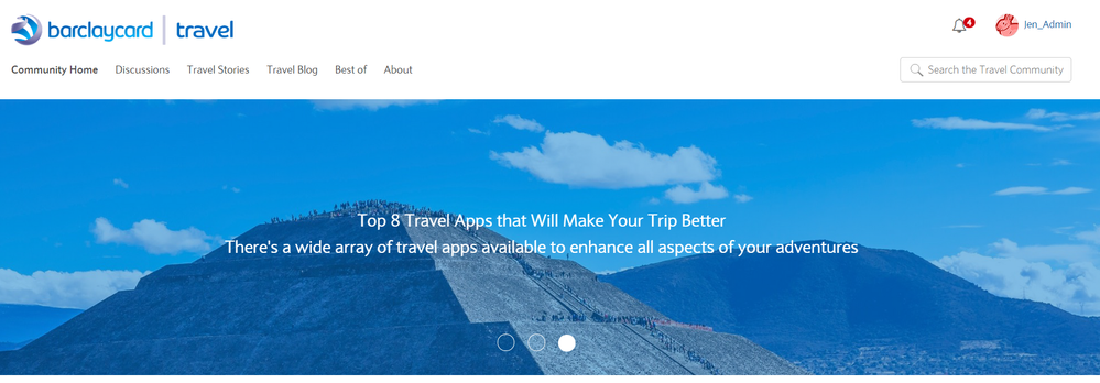
NEW Responsive Design:
Our Community Goals
Our recent responsive redesign project focused on three main areas for improvement:
- Business Objectives: Increase engagement and participation of cardmembers & community members (kudos, discussion comments, blog/travel story comments) and develop areas on the site to expand our super-user strategies and build influencer relationships. We also want to expand the usage of the discussion board to address FAQs cardmembers, or potential cardmembers, have about the Barclaycard Arrival+ credit card. Our objective is to provide relevant content that will assist with call deflection to our call centers.
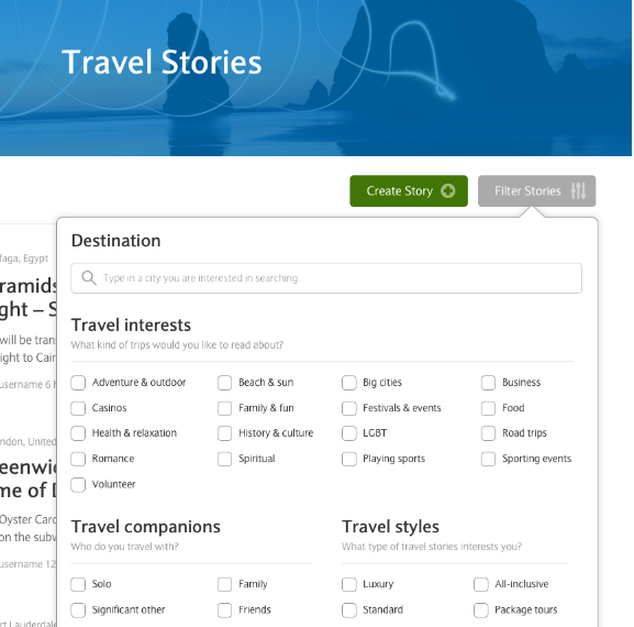
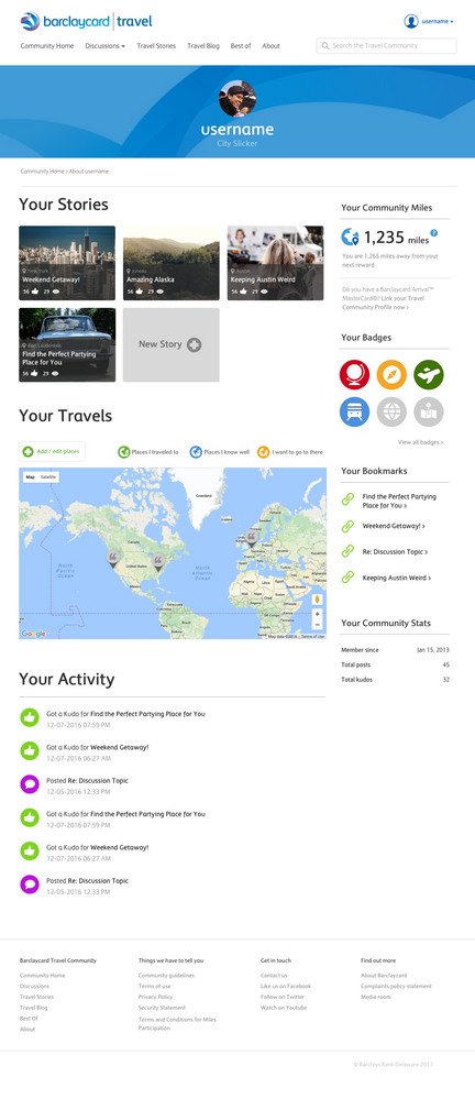
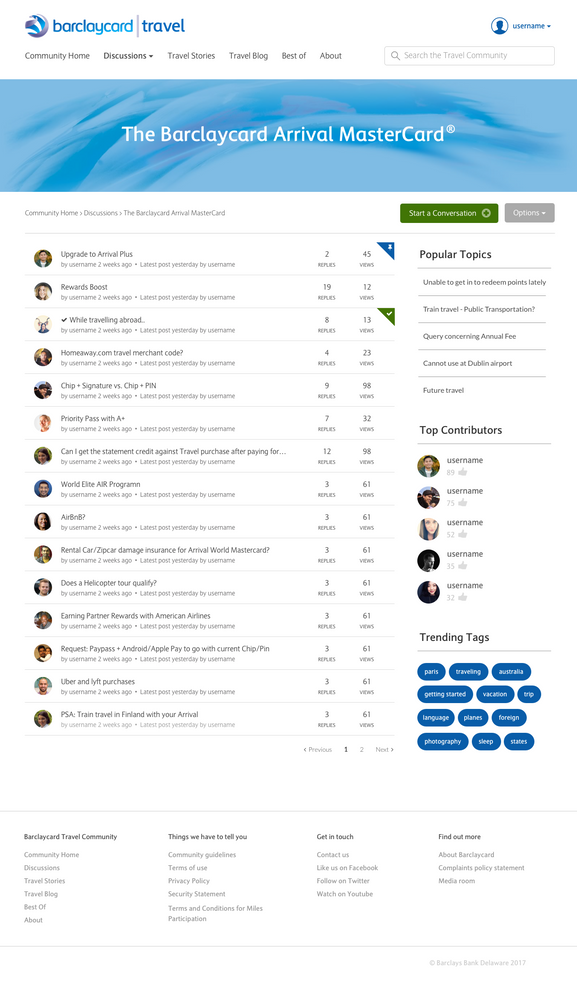
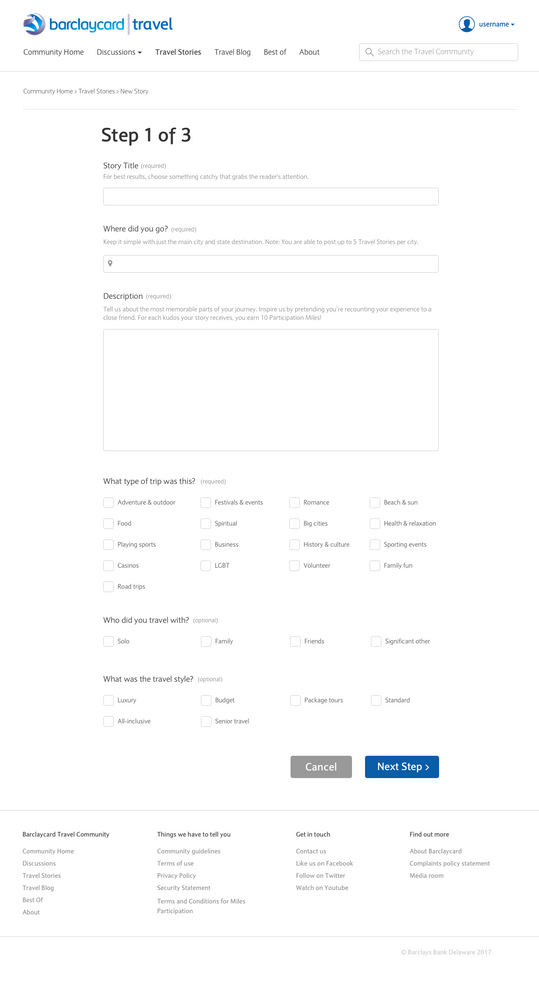
- Community Member Benefits: We focused a great deal of our time in the brainstorm sessions to make the user experience more streamlined. We built a structure that made uploading stories painless and mobile-optimized and enhanced the search capabilities to make the community easier to explore. We re-evaluated our ranks and badge structure to create a greater focus on gamification. Realizing the discussion boards were not that vibrant, we redesigned the home page to make discussion boards easier to find, explore and post. And, because our users are proficient travelers who take pride in their stories and knowledge, we wanted the profile of a user to become a sense of pride.
- Data & Content: The redesign goals also focused on improving the quality of UGC and enhance the discussion board experience. We modified the home page to be able to feature curated content more prominently vs. only having UGC content post in real time. We also focused on giving our travel bloggers a stronger voice and platform and created a method for our prolific super users to submit blog posts for potential publishing. In the redesign model, we laid out a workflow for how we can use the feedback from community members to inform product changes, or marketing strategy, back to the product owners.
These three pillars helped to focus our efforts of our redesign project and utilize the latest improvements and capabilities of the Lithium responsive platform. We wanted to expand the home page content to focus on the variety of ways that a community member can engage within our community and become inspired to learn and to share their own experiences. We created a unique, stylized design for the home page modules that featured the discussion boards, recently posted threads, and our “Best of” curated section.
Our Unique Design Elements
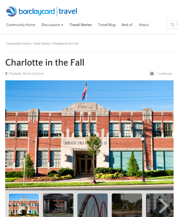
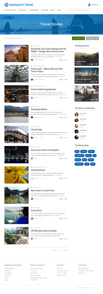
Our new, responsive design provides a sleek, sophisticated layout that inspires exploration by emphasizing the varied and vibrant photos within travel stories and blog posts. The content was completely restructured on the home page for desktop and mobile.
- Community Managers and Content Strategists can easily adjust the ‘hero’ area at the top of the home page to highlight certain themes, promotions or user generated content.
- Users can easily navigate the four featured content areas.
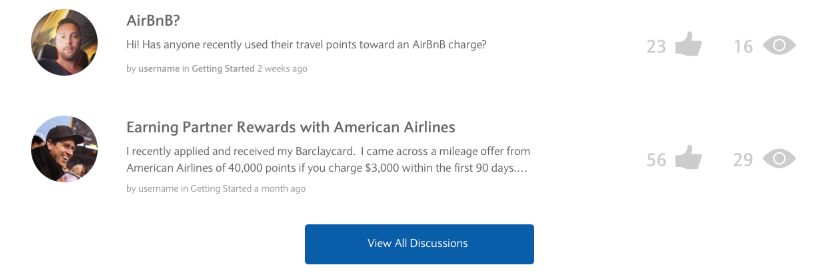
- Discussion boards and their contributors are featured prominently at the top of the home page. This type of ‘front page’ exposure for contributors helps to reinforce the intrinsic value of the Travel Community.
- Top Contributors and curated content selected by Community Managers feature prominently on the home page.
- Mobile View: The responsive elements of the platform provided our teams the capability to structure the layout in a consistent manner while still playing true to the single purpose to “inspire travel.” The mobile experience was vastly improved with the various modals stacked and the streamlined navigation within Travel Stories (viewing photos and map details).
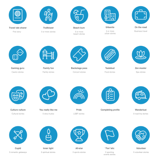
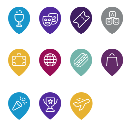
- Iconography: We also deconstructed our iconography throughout the site to make the experience consistent. Icons for badges were created with a similar palette that also prominently featured the uptick of volumes for each badge.
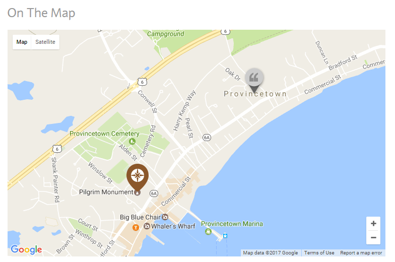
- Enhancements: Our icons that are used to pin travel details to the Google maps integration, were streamlined and redesigned so it was simple for users to see what type of details were available to them when reading a travel story.
Execution of our design
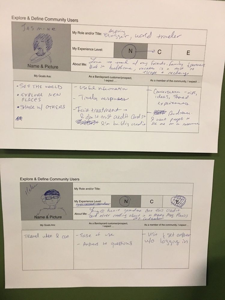
Brainstorm sessions – and lots and lots of post-it notes! Our community team, product owners, tech folks and the Lithium core team huddled together to analyze the key stakeholders related to the Travel Community. This post-it note and drawing exercise (literally drawing) stretched the teams to remove all preconceived notions about what the Travel Community ‘was’ and ‘what it could become.’
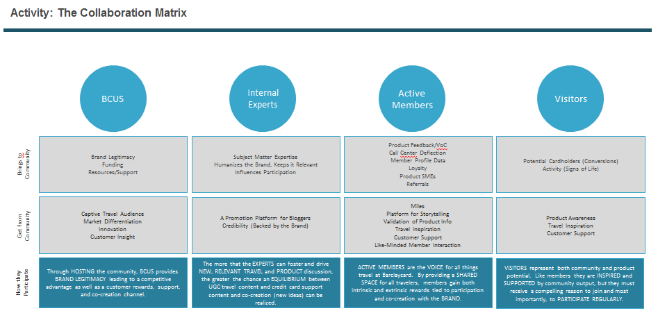
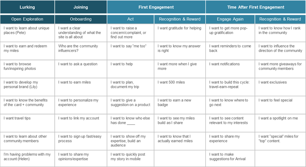
We identified four key user groups and then moved forward with mapping out what each of those groups meant to each other (aka a ‘collaboration matrix’).
We analyzed each stakeholder group. For example, we looked at our Active Members –who they were, why they would visit our site, the reasons they might only explore, what would inspire them to post or contribute, what would make them return again and again. We built out a matrix that we could use in the future when mapping out content strategy and marketing plans.
Merged our three pillars with designs: We then came back around to our three pillars we identified in the beginning phase of this project and started to map out functionality and UX capabilities:
- Better search and improved engagement with discussions:
- Creating a profile hub and activity feed as a personal source of pride to encourage repeat visits. And improve game mechanics to increase engagement.
- Leverage Lithium-standard discussion engine to make forum management simple and upgradeable and utilize tagging structure more efficiently. And improve wayfinding through breadcrumb navigation.
- Improve readability, photo exploring and made the upload process for a travel story painless and easy (especially from any mobile device).
- Use consistent design patterns for more efficient development and better user recognition.
- Give Travel Stories its own ”home” to free up the community home page for more content variety:
Our design excellence results
Our responsive design is slated to launch in mid-May and we are projecting the following metrics:
- Mobile traffic increase from an average of 13% to an average of 30%
- Cardmember registrations into the Travel Community increase by 15%
- 35% more travel stories uploaded due to the streamlined mobile experience
- Increase page views to Discussion Boards from 15% overall traffic to 25%
- 30% increase in referrer traffic page views (14K/month to 18K/month)
- Expected increase of 50K-75K unique visitor monthly thanks to new responsive community and promotional launch plan
05-12-2017
01:58 PM






You must be a registered user to add a comment. If you've already registered, sign in. Otherwise, register and sign in.